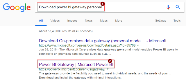
Changing the X and Y axis values based on Slicer Selections in Power-BI
Description:
This blog consists of the dynamic change of X and Y chart values based on Slicer data Selection.
Step 1:
Source: Excel File Sheets
Sheet 1:

Sheet 2:

Sheet 3:

Sheet 4:

Sheet 5:

Step: 2
As per our requirement, we need to create one calculate table and insert data based on variable values. Now go to modelling option and Click on New Table then Table will appear on Design Part.

Step 3:
Now we can create variables and assign particular source data as variable values.

Step 4:
Table structure and data created based on the above variable values.

Step 5:
Now we need to write one calculated measure in a calculated table for dynamic X&Y chart changes.
Used DAX functions:
1. If 2. Hasonevalue 3. Switch 4. Calculate 5. Sum 6. Treatas
Measure: Measure = if(HASONEVALUE('Table'[Name]),
SWITCH(VALUES('Table'[Name])
,"Amar",CALCULATE(SUM(Sheet1[Level])
,TREATAS(VALUES('Table'[Domain])
,Sheet1[Domain]))
,"Naveen",CALCULATE(SUM(Sheet2[Level])
,TREATAS(VALUES('Table'[Domain])
,Sheet2[Domain]))
,"Jagadeesh",CALCULATE(SUM(Sheet3[Level])
,TREATAS(VALUES('Table'[Domain])
,Sheet3[Domain]))
,"Deepak",CALCULATE(SUM(Sheet4[Level])
,TREATAS(VALUES('Table'[Domain])
,Sheet4[Domain]))
,"Jana",CALCULATE(SUM(Sheet5[Income])
,TREATAS(VALUES('Table'[Domain])
,Sheet5[Business ]))
)
)
Step 6:
Now we need to drag slicer from visualization panel to Designer part.

Step 7:
Drag Name column to the card graph field, then slicer will be affected by Name column data.

Step 8:
Drag Clustered column chart from the visualization panel to Designer part.

Step 9:
Drag Domain column to Axis field and also drag measure to Value field then Clustered column chart will be visible by the above two column.

Step 10:
Now the chart will be impacted by slicer selection, following pictures is showing the changes in X&Y values in the chart.
Picture 1:

Picture 2:

Thank you.

kayseriescortu.com - alacam.org - xescortun.com
ReplyDelete